Guess who’s back? Back again? :)
I don’t know where to begin…I’ve been ridiculously sidetracked from this beloved project of mine for too long now. Am in full time work and had pushed this unfinished ebook into the corner since I completed my masters and received a distinction 🙂 My conscience has been nagging me ever since to finish it as I see fit and comments that I saw just a few minutes ago when I logged back into the blog after months of inactivity have spurred me on to jump the final hurdle and publish this ebook once and for all. Thank you all for your kind words. I’m back in business and will be posting up my plans very shortly 🙂 Stay tuned!
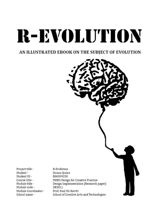
Cover of book as it is now
It’s finally done! On this blog you will find everything I’ve gathered, researched, read, watched and drawn. Enjoy! 🙂
First complete draft of illustrated book nearly ready!
‘It was the best of times. It was the worst of times’
This is how I’m feeling at the moment, I’m excited to be this far but I have a list that runs down past my toes that I’ve yet to do. I’ve also nearly written the first draft of my final dissertation. I’ll obviously not be uploading any more of the book to date nor my final essay but I’ll keep the blog updated with how I’m coming along
Busy seven weeks ahead!
It’s so much scarier than if you call it a month and a half! I’m on my second chapter today and am happy with how its going. When I have this entire draft done. I’m going back to the start and fixing up any little typography mishaps with the help of a fantastic Indesign type book. Colour will be added at this point also. I’ve only just realised that I shouldn’t post any pages of the final draft up here seen as I’m hoping to sell it on Amazon in September! But I will upload my planning sheets which give a good indication of the final layouts.
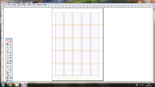
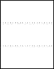
Sample of grid I’m working with
I’m working on a 5 column, 5 row grid. It allows me to be very flexible with my page layout. It may not look like much now but it’s the skeleton of any successful design layout
Fantastic guide to help me balance the design of my pages
| Symmetrical Balance |
Symmetrical balance is easiest to see in perfectly centered compositions or those with mirror images. In a design with only two elements they would be almost identical or have nearly the same visual mass. If one element was replaced by a smaller one, it could throw the page out of symmetry. To reclaim perfect symmetrical balance you might need to add or subtract or rearrange the elements so that they evenly divide the page such as a centered alignment or one that divides the page in even segments (halves, quarters, etc.).
When a design can be centered or evenly divided both vertically and horizontally it has the most complete symmetry possible. Symmetrical balance generally lends itself to more formal, orderly layouts. They often convey a sense of tranquility or familiarity or elegance or serious contemplation.
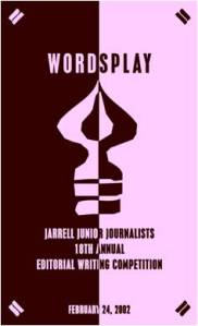
Vertical Symmetry — Each vertical half (excluding text) of the brochure is a near mirror image of the other, emphasized with the reverse in colors. Even the perfectly centered text picks up the color reversal here. This symmetrically balanced layout is very formal in appearance.
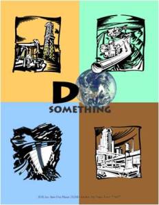
Vertical & Horizontal Symmetry — This poster design divides the page into four equal sections. Although not mirror images the overall look is very symmetrical and balanced. Each of the line drawings are more or less centered within their section. The graphic (text and image) in the upper center of the page is the focal point tying all the parts together.
| Asymmetrical Balance |
Asymmetrical design is typically off-center or created with an odd or mismatched number of disparate elements. However, you can still have an interesting design without perfect symmetry.
With asymmetrical balance you are evenly distributing the elements within the format which may mean balancing a large photo with several small graphics. Or, you can create tension by intentionally avoiding balance.
Uneven elements present us with more possibilities for arranging the page and creating interesting designs than perfectly symmetrical objects. Asymmetrical layouts are generally more dynamic and by intentionally ignoring balance the designer can create tension, express movement, or convey a mood such as anger, excitement, joy, or casual amusement.

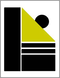
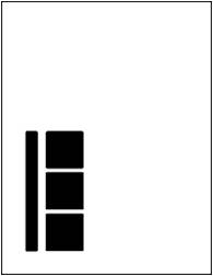
Asymmetrical Balance – This page uses a 3 column format to create a neatly organized asymmetrical layout. The two columns of text are balanced by the blocks of color in the lower left topped by a large block of white space. In this case, because the white space is in a block shaped much like the text columns, it becomes an element of the design in its own right.
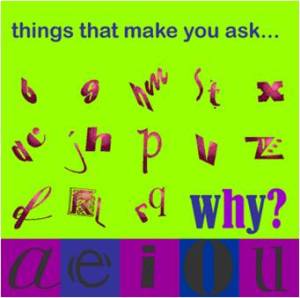
Asymmetrical/All Over Balance – It can’t be neatly sliced in half like a symmetrical design but most of the elements have only small differences in shape and mass. This page achieves an overall balance by use of an underlying grid that spreads the many pieces out over the entire page, more or less evenly.
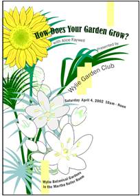
Asymmetrical Tension – Like a wild, unruly garden, the elements of this brochure cover are barely contained on the page. The plants spring up primarily along the left side but with a few stems escaping and arching across the page. The text, although randomly placed, follows the lines of the plants keeping them anchored to the overall design. The off-balance design creates a sense of freedom and movement.
Hands-On Exercise
Look for examples of asymmetrical balance, do these exercises and answer these questions (to yourself).
- How many examples of asymmetrical balance can you find?
- Examine the elements within the piece to see how the designer arranged them to achieve a balanced design without symmetry.
- Look for pieces that appear to be intentionally out of balance?
- How does the balance contribute to the mood of each piece? Is it dynamic? Does it appear to move in a certain direction or vibrate on the page?
| Radial Balance |
On square and rectangular pages we generally place elements in orderly rows and columns. With radial designs the elements radiate from or swirl around in a circular or spiral path.
Parts of the design must still be arranged so that they are balanced across the width and length of the page unless you’re intentionally aiming for a lack of balance.
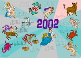
Radial — Here we have an example of radial balance in a rectangular space. The year represents the center of the design with the subtle color sections radiating from that center. The calendar month grids and their corresponding astrological symbols are arrayed around the year in a circular fashion.
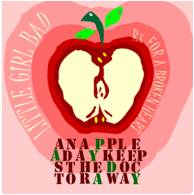
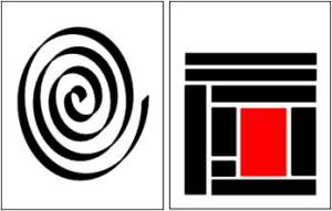
Radial — Colors and text radiate out from the apple in the middle of this CD cover design. The effect is almost one of spiralling down into the center of the apple. The apple itself looks nearly symmetrical but the curving text and the outlines edging off the page to the top and right throws it all slightly off-balance.
| Rule of Thirds, Visual Center, Grids |
Underlying most of the layouts on the previous pages are three related aspects of page layout and balance. These are layout principles that help the designer achieve arrangements with visual balance.
Rule of Thirds and Balance
The rule of thirds says that most designs can be made more interesting by visually dividing the page into thirds vertically and/or horizontally and placing our most important elements within those thirds. Take this concept a step further, especially in photographic composition, by dividing the page into thirds both vertically and horizontally and placing your most important elements at one or more of the four intersections of those lines.
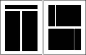
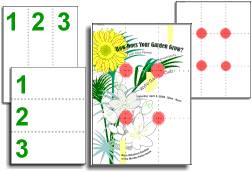
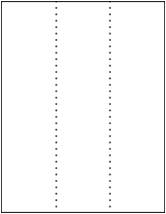
Look at these previous balance examples and see how the rule of thirds is utilized.Below: In this vertically symmetrical layout the headline appears in the upper third of the page, the logo in the middle third, and the supporting descriptive text in the lower third. The most important information is in that lower third and anchors the page.
Below: This asymmetrical layout has most elements in the upper third and leftmost third of the page with the main focal point being around the intersection of the topmost and leftmost dividing lines.
Visual Center and Balance
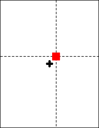
Placing important elements or the focal point of the design within the visual center of a piece is another design trick. The visual center is slightly to the right of and above the actual center of a page.
See how the focal or center point of each of these designs actually falls in the visual center of the page. Below: It’s easy to see the actual center, it’s where the four box corners meet. But the focus is on the earth.
Below: In this calendar, the months emanate from the year located front and (visual) center.
Grids and Balance
Roughly dividing a page into thirds or finding the visual center are relatively easy and you don’t usually have to be exact to achieve your goals. However, constructing the underlying structure of a piece is a bit more complicated — but essential for most designs. Most balanced designs (and even unbalanced ones) rely on a grid. This invisible structure (visible while working in your page layout program) helps ensure that you place all the elements in the right location to achieve balance as well as to help with continuity and consistency of design.
Grids can be simple or complex depending on the needs of the design and the designer.Sometimes the use of a grid is obvious. Below: This asymmetrically balanced design uses a simple three column grid to ensure that each text column is the same width and that it is balanced by the nearly empty column on the left. The grid also dictates the margins and ensures that the page number and header appear in the same place on each page.
Below: A 5×5 grid keeps this design in line. The grid is obvious along the bottom (each square equals one grid square in this layout) but it is invisibly keeping all those random letters in order in the middle.
Grids are an important tool in page layout and desktop publishing. This three-part supplemental material fully describes and illustrates the use of grids.
http://desktoppub.about.com/od/designprinciples/l/aa_balance.htm
I’m on the yellow brick road!!
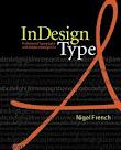
I have the book of my dreams…or at least the guide book of my dreams to help me create my book of dreams! It makes sense in my head anyway 🙂 I have the entire grid set up in my Indesign document ready to pour my writing and sketches into. The book that’s helping me to do this is is ‘Indesign Type CS2’
It’s so easy to follow, and it’s helping me to create the book as I want it to be. The next draft of my first chapter will be much better than the last one I put up, it was a nervous wreak, as was I! I’ll give you all a sneak peak when I have the first chapter redone.
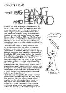
The very very very very very rough first draft of chapter one…you gotta start somewhere!
Okay, can’t believe I’ve actually got this much done without having a mental breakdown…it’s quite a terrifying experience to do the research and confidently talk about this book and then actually create it! Here’s the first draft of chapter one. I like my sketches, might add a few dabs of colour here and there. Not crazy on my grids or typography yet but have never declared typography as my strong point in design. But have ordered an excellent Indesign typography book to help me make the best of the dimensions I have to work with for the kindle screen. I am determined to make this book look its best and do me justice by the time it’s done.
Delighted with my Postgraduate Diploma results…have to up the rev now for the final furlong!
I’m in a great place right now…if I can keep remembering the passion I’ve poured into this book and to hold onto the message I want my work to bring, then I’ll get through this summer. Such a challenging time, I’ve never felt so much pressure!
Here’s a tip I wish I’d known earlier…but why are there so many damn formats???!!!
Here’s a great article that’s helping me to recreate my first chapter draft and produce the best graphics possible. I want to get this chapter perfect before I do the rest so I can confidently say that I like how it looks. Scary times, these are!
TIFF vs PSD vs EPS vs PDF vs…
It seems like every few months this topic pops up again: Which is the best file format to use for graphics? Some folks insist that everyone should use EPS and TIFF. Others think AI and PSD. And what about PNG or JPEG?! Here’s my take on the subject, after over 20 years of doing this:
EPS is a dying format. There is virtually no reason for you to ever save anything yourself as EPS. Here are good reasons to use an EPS file:
- if you already have an old vector graphic (from Illustrator or Freehand or something);
- if some software is making it for you (such as this Barcode plug-in); in this case, the software is likely doing special stuff that can only be done in PostScript, then encapsulated in the eps.
PDF is the current and future of publishing. If you have a vector Illustrator document, save it in PDF or AI (see below). The only reason to save a Photoshop document as a PDF is if you have vector type or “shape” layers. (No other format, besides eps, can save vector info from PS.)
AI (native Illustrator format) is great for most files from Illustrator, as long as you’re not using them in other programs. If you’re going to use them in something other than InDesign, consider using PDF instead. By the way, if you save an .ai file, make sure you include the PDF in it (that’s an option when saving), or else InDesign can’t read it.
PSD (native Photoshop format) is great for most files from Photoshop, as long as you’re not using them programs other than InDesign, and there’s no vector stuff in there that you’re trying to save. PSD has the benefit over TIFF in that it can save layers, layer comps, and duotones (or tri- or quadtone images).
TIFF is a terrific format that everyone can agree is useful, at least for raster (bitmapped) images in print workflows. You have the option to save transparency and layered files. A few years ago, I used TIFF for everything, but I have to admit that I’ve strayed more recently to PSD and JPEG. The main reason to use TIFF (instead of JPEG or PSD) is when you need a bitmapped image suitable for a lot of different programs, not just InDesign.
JPEG (or JPG, if you’re a three-letter extension kind of person) is totally great, as long as you’re talking about photographic images. Yes, you can use this for print, too, if you use the Excellent/Maximum quality. (There are plenty of people who say never use it for print. These are the same people who say that all printing must be done gravure. Ignore them.) For synthetic images with sharp lines (such as type on a solid background), JPEG is not so good because you’ll see artifacts. Of course, images saved with lower quality (higher compression) will also show artifacts, so be careful. Also, JPEG isn’t so good if you’re going to be editing the file repeatedly — it’s really a final-version file format. If you’re going to be editing the file in the future, consider PSD.
PNG is great for interactive documents (such as EPUB or HTML export), but not for print. This is the format you should use (instead of JPEG) if your graphics are solid colors against solid colors (sharp, non-photographic edges).
These days, when it comes to Photoshop images, I generally save PSD about 60% of the time, JPEG 20% of the time, and the rest split up between PDF, TIFF, and PNG. For Illustrator graphics, I use AI about 75% of the time, PDF about 20%, and other stuff about 5%.
There are lots of other formats, such as the old DCS (required for spot colors in the dark ages; not I just use PSD or PDF), GIF (not really relevant; png is better in many cases), and PICT (you’re kidding, right?)… but you’re going to be happiest if you stick with one of the formats above.
